· Jack Young · Education · 7 min read
Unit 28 (M2, D2): Tools and Techniques Used in the Creation of an Interactive Website
Explain the tools and techniques used in the creation of an interactive website and discuss the techniques that can be used on web pages to aid user access to information.

Tools and Techniques
Explain the tools and techniques used in the creation of an interactive website (M2)
Navigation Diagram
Navigation diagram is for websites that shows how websites with linked web pages are accessed and structured. Websites usually use three different navigation structures; linear, hierarchical and matrix.
Linear
Linear navigation structure flows forwards and backwards by linked web pages. This structure is only suitable for basic websites. The drawback for this structure is users may find this to be difficult to navigate through linked web pages considering you can only access the next linked web page.
Hierarchy
Hierarchical navigation is structured with each web pages linked with a number of different pages. The content of the website is usually structured with the lowest in the hierarchy containing all the content provided in the website; as the hierarchy gets higher, the content is more refined by the user is trying to locate.
Matrix
Matrix navigation is structured with all the web pages are linked with each other. There is no dedicated homepages as most websites contains. Although the navigation is structured insufficiently, each web page provides simple and easy bidirectional links.
Building Interactivity Tools
Pseudocode for Client-Server Scripting
Pseudocode is detailed and a readable description of what a computer program or algorithm does. Pseudocode is presented formally using natural language rather than programming language. Pseudocode allows designers or lead programmers to express the design in great detail and provide programmers a detailed template for the next step of writing code in a specific programming language.
If student grade is greater than or equal to 60
 Print "Pass"
else
 Print "Fail"
I have not used Pseudocode in my website code because there is no complex algorithm or other codes that I need to explain. The code I used is very simple and most HTML users can figure out what it does by reading it.
Animation
Animation elements on websites are less common than audio/visual elements. You usually use animation to improve the appeal of the website, but most of the time it is not needed. Animations are usually in the .swf format. I have no animation on my website; I used pictures instead because it is simpler which applies to my theme.
Audio/Visual Elements
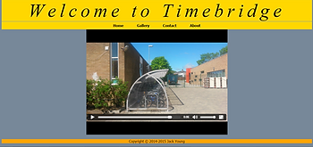
On a website, there are usually more visual elements than audio elements used, you usually find audio elements if the website uses videos, like YouTube. I put in a video of the outside of Timebridge on the home page of the website which is a visual element. I have also added a Gallery filled with pictures which are also visual elements. All of the pictures have a .jpg format and when you click on the picture, it goes full screen where you can look at it better.
Ensuring Compliance with W3C
W3C stands for World Wide Web Consortium. If your website is up to these standards, it will become W3C certified, which has a few benefits. Firstly, the site will function well across various hardware platforms and operating systems. Finally, it will allow search engines to rank your website better, potentially producing more traffic to your site.
Meta Tags
Meta Tags are keywords that describe the website. These words are usually picked up by search engines to help rank the site correctly. By having Meta Tags in your code, you are likely to get more traffic to your website than the websites that do not put Meta Tags in. Meta Tags usually go at the start of the HTML document. I have not decided to use Meta Tags on my website because it is not going to go online and therefore I do not need this feature.
Cascading Style Sheets
Cascading Style Sheets (CSS) allows you to carry designs from one web page in your website to another without any hassle all by just linking your CSS on each web page. Storing all of your design criteria in one file allows you to change the design of your entire website by only changing your CSS and not having to update every single web page you have created which could cause a lot of problems. I have used CSS to further improve my website structure. CSS has allowed me to make a professional and simple theme that I can use on all of my pages.
Aid User Access to Information
Discuss the techniques that can be used on web pages to aid user access to information (D2)
Colour Blindness
There are different types of colour blindness. Some people see everything in monochrome, others may have a common colour blindness of red-green; this is where the person finds it hard to distinguish red and green hues. There are others such as the blue-yellow colour blindness and many more. The different types of colour blindness can cause the colours of the site to appear differently to what is intended. This may mean that the text on the site maybe hard to distinguish from the background. For example, the buttons on the navigation bar may appear to have the same colour as the rest of your page, so that the colour-blind person reading may not realise that those are buttons.
If possible, do not make your site dependent on colours. For example, if the only way to distinguish a link from normal text on your site is by its colour, and you’re not careful when choosing your colours, it is entirely possible that a colour-blind person will not be able to see any links on your site. For the main content, it is generally best not to remove the underlining from your links. Where you have important information, try to use black text on a white background. This colour scheme is mostly readable by anyone.
Poor Eyesight
Some sites have very small text. Those sites are most likely focused on aesthetics and looks instead of text. Those designers think that the text is a part of the sites visual appearance rather than the most important part of the page. It is also possible that they have designed the site on a large monitor. The problem with this is that these sites are unreadable on smaller screens even if people have normal eyesight. As you design the website, you need to remember that aesthetics is not the most important part of a website and is not the reason why people visit your site, unless the site is mainly a portfolio of your work. If your visitors cannot see the text, or find great difficulty reading, your site is not going to be as successful as it can be.
Images
Some people like to create web pages that are filled with pictures, sometimes the navigation bar, like links, are represented by images. These sites can be terrible for people who are blind. They can also hurt the sites search listings; this is because when people search keywords on a search engine, they may be unable to find your site because there may not be any text or meta-tags included in the images, or the text is an image itself and will not show up.
Obviously, just having images that link to other pages on your site does not necessarily mean that your site is inaccessible, since separate images linking to exterior sites can still result in an accessible site. These sites have the navigation elements on your page require a person to be able to see the image and move the mouse to click at specific spots in the image or object. A CSS-driven menu button system would be also suitable for this since, despite its graphical appearance; it is entirely text-driven.


